
Optimize Your Product Pages for Whole Foods: AEO, Trust Signals and Conversion Tips
A tactical guide to AEO, trust signals, and UX fixes that help whole-food product pages rank and convert better.
Whole-food product pages have a bigger job than standard ecommerce pages. They must answer shopper questions quickly, prove ingredient integrity, and make it easy to buy with confidence. In a category where people compare sourcing, certifications, and package details before they add to cart, your page needs to work like a sales associate, a nutrition label explainer, and a search answer all at once. That is why AEO and ecommerce SEO are no longer separate disciplines for whole-food sellers; they are part of the same conversion system.
If you want a practical framework, start with the shopper journey and then layer in trust. We recommend pairing this guide with our broader perspective on whole-food pantry staples, how to build meal plans for busy homes, and the ways curated assortments can simplify purchasing decisions through bulk buying. Product-page optimization is not only about ranking; it is about reducing uncertainty so the right shopper can say yes faster.
Search behavior has also changed. Many shoppers now ask search engines and AI assistants question-style queries like “Is this organic oat flour non-GMO?” or “Which almond butter has no added sugar?” That means your page must be machine-readable, human-readable, and trust-rich. For a broader strategic view on the role of answer engines in ecommerce, it helps to understand how AEO is reshaping customer experience and conversion across retail. The same logic applies to whole foods: if your page can answer the question cleanly, you are already halfway to the sale.
1) Why Whole-Food Product Pages Need a Different Optimization Strategy
Whole-food shoppers are buying certainty, not just ingredients
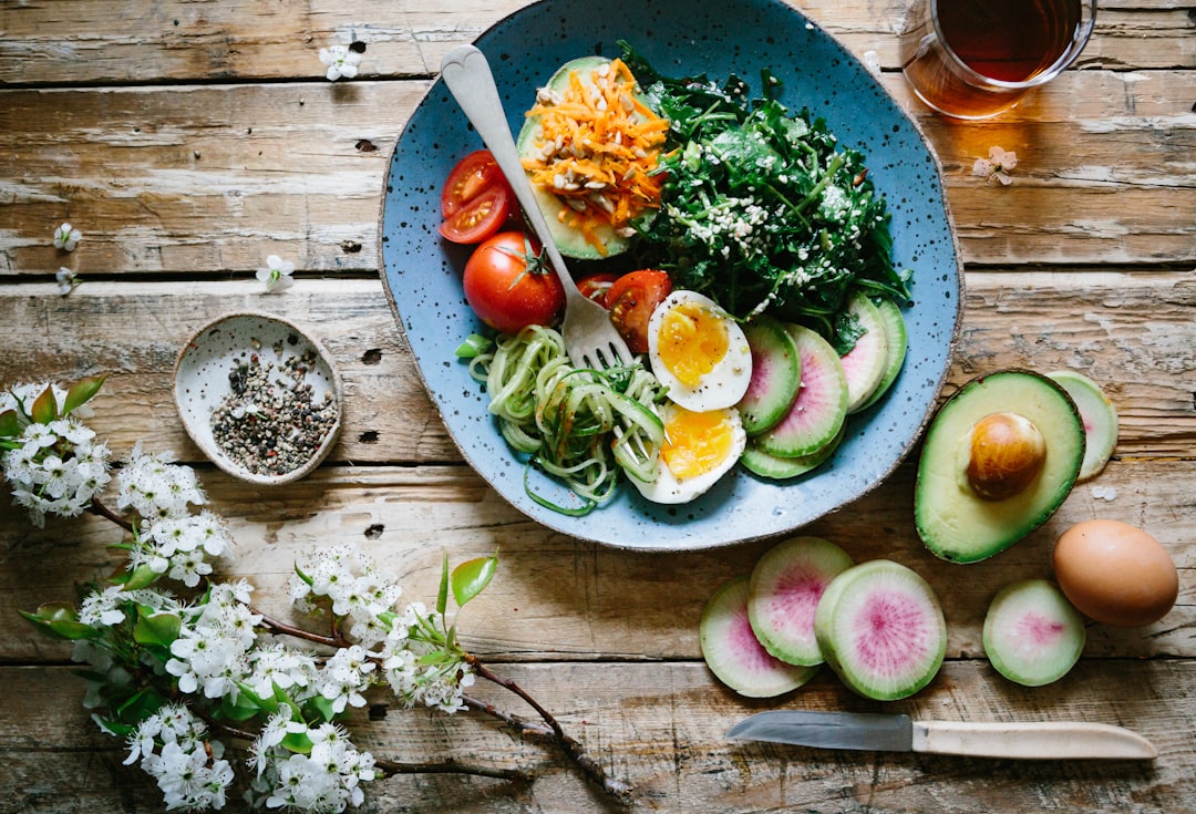
For many categories, product pages can lean on brand familiarity, slick visuals, and a few persuasive bullet points. Whole foods are different because the shopper is often evaluating the product itself, the sourcing behind it, and whether it fits a specific dietary pattern. A shopper buying avocado oil or sprouted grains is not just looking for flavor; they want confidence about extraction methods, processing level, and label honesty. That means product optimization must address both search relevance and purchase anxiety.
Answer engines reward directness and specificity
AEO works best when pages contain concise answers to likely questions, and whole-food products are full of them. Think of questions about origin, ingredient count, allergens, certifications, and storage life. If your content uses vague claims like “healthy” or “natural,” you are making both shoppers and search systems do extra work. Specific phrasing such as “single-ingredient, cold-pressed, USDA Organic olive oil” is much more discoverable and more persuasive.
Conversion starts with clarity before creativity
Many stores over-focus on lifestyle photography or brand story before they fix the basics. But if the shopper cannot quickly understand what the product is, how it was sourced, and whether it meets their needs, the page will leak conversion. Use the product page to preempt doubt, not amplify it. This is the same principle behind how smart sellers approach decision support in other categories, similar to the way smart operators use AI-assisted product selection to reduce guesswork and increase relevance.
2) Build an AEO-Friendly Product Page Structure
Lead with the exact product answer
Your first visible copy should say what the product is, who it is for, and why it is different. A strong opening formula is: product type + key attribute + use case. For example, “Organic stone-ground buckwheat flour for gluten-free baking and pancakes.” That sentence helps shoppers and AI systems immediately interpret the page. The clearer the first line, the fewer friction points you create downstream.
Use question-based subheads and short answer blocks
AEO-friendly pages should include question-led sections such as “What makes this almond butter different?”, “Is it certified organic?”, and “How should I store it?” These should be answered in short, direct paragraphs near the top of the page. Then you can expand with detailed details lower down. If you want a model for answering customer questions with precision and measurement, consider the logic in metrics-driven conversation design: the content should resolve intent, not just fill space.
Structure content so scanners and humans both win
Bullet lists, labeled specs, and tightly written descriptions help shoppers compare products quickly. Search systems can extract ingredients, certifications, pack size, and dietary compatibility from clean markup and semantically organized text. Avoid burying important facts in paragraph fluff. Put the facts where the eye expects them: near the title, near the image, and near the add-to-cart button.
Pro Tip: If a shopper asks, “Can I trust this product?” your page should answer with ingredients, sourcing, certifications, and image evidence within the first screen, not three scrolls later.
3) Product Descriptions That Rank and Convert
Write for both search intent and shelf comparison
Whole-food product descriptions should include the keywords shoppers actually use, but they must sound natural. Instead of repeating “healthy” over and over, specify attributes such as “minimally processed,” “single-origin,” “no added sugar,” or “sprouted.” These descriptors are valuable because they map to buyer filters and to informational queries. If your product page answers “What is this?” “Why choose it?” and “How do I use it?” you are serving all stages of the buying process at once.
Translate ingredients into real-life benefits
Ingredient lists matter, but they should be interpreted for the shopper. For example, “only two ingredients” is easy to understand, but explaining that “this matters because it reduces exposure to emulsifiers and added sweeteners” adds credibility. You do not need to overstate benefits; just clarify them. This is especially useful for shoppers balancing dietary restrictions, and it aligns with the practical framing used in reading food labels for clean ingredients.
Include usage ideas that remove hesitation
A product page converts better when shoppers can picture the product in their kitchen. Add simple serving ideas, meal pairings, or substitutions. A jar of tahini is easier to buy when the page suggests salad dressings, sauces, and baking swaps. For more inspiration on turning pantry items into meals, see our guide to whole-food breakfast ideas and simple whole-food dinner ideas.
4) Trust Signals That Actually Convert Browsers into Buyers
Certifications should be visible, not hidden
Food certifications are high-value trust signals because they reduce ambiguity. If a product is USDA Organic, Non-GMO Project Verified, gluten-free certified, kosher, or Fair Trade, those marks should appear near the top of the page and again in the specs area. But the badge alone is not enough. Add a plain-language explanation of what the certification means and, just as important, what it does not mean. For buyers who carefully compare labels, that transparency is more persuasive than hype.
Sourcing details create credibility
Shoppers often want to know where an ingredient came from, how it was grown, and whether the brand can substantiate its claims. This is especially true for oils, nuts, grains, spices, and packaged produce. A page that says “sourced from small family farms in California” or “third-party tested for heavy metals” is doing work that generic copy cannot. The same trust-first principle shows up in other categories, such as how verification clues help shoppers tell real value from marketing noise.
Labeling honesty beats aggressive selling
If your product is lightly sweetened, say so. If it contains a functional ingredient like sunflower lecithin, explain why it is there. If the package size changed, disclose it clearly. Trust signals are not just certificates and seals; they are also consistency, clarity, and accuracy. Brands that overclaim may get the click, but they do not keep the customer.
For sellers planning catalog strategy, this is a lot like how organic versus conventional pantry staples are compared by shoppers: the details matter, and the best pages make those details easy to verify. If you also sell refrigerated goods, the same transparency standard should extend to freshness claims and storage expectations, much like sustainable refrigeration matters to produce quality and trust.
5) Packaging Images: The Most Underused Conversion Asset
Show the front, back, and close-up details
For whole foods, packaging images are not decorative. They are evidence. The main hero image should show the front of the package clearly, without excessive props or clutter. Then add back-of-package shots, close-ups of ingredient panels, and an image of the nutrition facts label. A shopper buying a grain-free granola or olive oil wants to inspect the label the same way they would in a store aisle.
Use images to answer unspoken questions
The best product image sets answer practical questions before the shopper asks them. How big is the bag? What does the pour spout look like? Is the resealable feature real? Is the product opaque, frosted, or clear? These details reduce returns and boost confidence. If you want to think more carefully about what packaging promises in adjacent categories, our guide on eco-friendly packaging is a useful parallel because freshness, transparency, and convenience all influence trust.
Optimize images for speed and accessibility
Beautiful images can still harm conversion if they slow the page down. Compress files, use descriptive alt text, and keep the most important images near the top. Alt text should describe the product and the visible trust signal, such as “Organic black chia seeds package front with USDA Organic seal.” That kind of phrasing is useful for accessibility and search. For more on how visual signals shape discovery, see attention metrics and story formats, which show why clarity often outperforms cleverness.
6) Product Optimization Checklist for Whole-Food Ecommerce SEO
Title tags, H1s, and metadata should match shopper language
Product titles must be explicit, not poetic. Include the product type, key dietary attribute, and differentiator in the title when relevant. The page title and H1 should usually align closely so both users and search engines understand the page theme immediately. Metadata should reinforce the same value proposition without stuffing. When title language matches shopper intent, you attract better traffic and reduce bounce rates.
Use schema and structured data to support AEO
Product schema, review schema, FAQ schema, and breadcrumb markup help search systems interpret the page. For food products, structured data can support price, availability, brand, and nutritional fields, which is crucial for answer-engine extraction. The goal is to make every important attribute machine-readable. Think of schema as the digital version of a clean ingredient list: if it is organized well, it is easier to trust and easier to use.
Make internal linking part of the page architecture
Internal links keep shoppers engaged and help search engines understand category relationships. Link to educational content about label reading, recipes, bundle options, and category comparisons. That helps move a shopper from product research into basket-building. It also strengthens topical authority around your store’s core themes, much like a good editorial structure supports broader site discovery. Useful supporting resources include understanding food certifications, how to store pantry staples, and meal prep with whole foods.
| Page Element | Best Practice | Why It Matters |
|---|---|---|
| Title | Product type + key attribute + use case | Improves relevance for search and shoppers |
| Hero image | Clear front-of-package photo | Builds immediate recognition and trust |
| Back image | Visible ingredients and nutrition facts | Answers label questions without extra clicks |
| Trust badges | Show certifications near title and specs | Reduces uncertainty and supports conversion |
| FAQ section | Answer top shopper objections directly | Supports AEO and lowers friction |
7) Quick UX Fixes That Raise Conversion Fast
Shorten the path to key information
Many product pages lose sales because essential details are too far down the page. Move price, pack size, certifications, dietary notes, and shipping information closer to the add-to-cart area. Add a concise “Why buy this” block that summarizes the main reasons in two or three bullets. If a shopper must hunt for the basics, they may leave before they ever consider the brand story.
Reduce decision fatigue with smart defaults
If you sell variations like pack sizes or flavors, preselect the most popular option and clearly label the differences. If subscriptions or bundles are available, make the value easy to understand without forcing a mental spreadsheet. This is where ecommerce UX and pricing strategy overlap. A helpful model for balancing price and value is the logic in stacking savings and trade-offs, even though the category differs. Shoppers want to know what they gain, what they give up, and whether the choice is worth it.
Use friction-reducing microcopy
Small lines of text can remove big objections. Phrases like “ships fresh,” “no refrigeration required,” “gluten-free certified,” or “sourced in the USA” reduce uncertainty. Use microcopy around cart buttons, delivery details, and subscription toggles to prevent last-minute hesitation. For stores offering rotating deals or bundles, a style similar to buying more without sacrificing quality is a useful framing: make value easy to see, not buried in fine print.
8) Measuring Product-Page Performance Like a Pro
Track more than clicks and pageviews
Conversion rate matters, but it is only one layer of product-page performance. Track scroll depth, image interactions, add-to-cart rate, FAQ engagement, and exits after viewing nutrition facts. These signals tell you where shoppers hesitate. If people click the page but leave before scrolling, the issue may be the title or image. If they scroll but do not convert, the issue may be trust or pricing clarity.
Use A/B tests to isolate trust improvements
Test one variable at a time, such as placing certifications above the fold, changing the image order, or rewriting the first three bullets. You do not need a massive redesign to see meaningful gains. In many cases, a tighter page with clearer evidence beats a prettier page with weaker proof. If you want a useful mindset for iterative testing, look at how ROI-focused measurement keeps teams honest about what actually works.
Let customer questions drive your next optimization sprint
Your support inbox, chat logs, and search queries are a goldmine. If people keep asking whether a product contains seed oils, whether a sweetener is added, or whether a package is recyclable, those questions belong on the page. Turn repeated objections into structured FAQ entries and supporting copy. That approach helps you serve both the shopper and the search engine without creating extra work for your team.
9) Practical Page Templates for Common Whole-Food Products
Dry pantry staples
For grains, legumes, flour, seeds, and nuts, prioritize ingredient simplicity, origin, texture, and storage guidance. Include exact net weight and clear visual references for package size. A shopper buying coconut flour or lentils wants to know freshness, batch quality, and how the product behaves in cooking. Pages for staples should also link to recipes and storage tips, such as pantry organization for healthy cooking.
Condiments, oils, and spreads
These products often live or die on processing details. Explain whether the item is cold-pressed, raw, unrefined, or single-origin. Because these products are often used daily, the page should be especially clear about flavor profile and serving suggestions. Add a visible note about storage after opening, because shoppers appreciate practical care instructions as much as marketing claims.
Frozen and refrigerated whole foods
For frozen produce, fermented foods, and refrigerated proteins, freshness and logistics are central to trust. Page copy should explain cold-chain handling, shipping windows, and expected shelf life. This matters because the customer is not only buying food; they are buying confidence that the food will arrive and stay usable. The same logic that powers resilient logistics in adjacent industries also supports grocery trust, much like cold chain planning under disruption protects product quality when fulfillment gets complicated.
10) Your Conversion Playbook for the Next 30 Days
Week 1: Fix the top of the page
Audit your hero image, title, first sentence, price visibility, and trust badges. Make sure the shopper understands the product within five seconds. If anything feels vague, rewrite it with sharper language and move the most important trust signals upward. This single pass often produces the fastest gains because it addresses the first point of abandonment.
Week 2: Improve the evidence layer
Add back-of-package images, ingredient close-ups, certification explanations, and sourcing details. If you have third-party testing, say so plainly. If you have farm or supplier transparency, surface it in a concise proof block. The aim is not to overwhelm the page, but to make trust feel effortless.
Week 3 and 4: Add supporting content and iterate
Build FAQ blocks, recipe pairings, storage advice, and comparison points against similar products. Then review analytics for signs of friction. If the page still underperforms, the issue may be offer structure, price perception, or weak differentiation. For broader merchandising support, it can help to think like a curator and assemble assortments that reduce choice overload, similar to the logic behind building a whole-food pantry on a budget and affordable whole-food bundles.
FAQ
What is the most important trust signal on a whole-food product page?
The most important trust signal is usually the combination of clear ingredient transparency and visible certification or sourcing proof. A badge helps, but a plain-language explanation of what the badge means is even better. Shoppers want to know what they are buying, why it is different, and whether the claims can be verified.
How does AEO differ from traditional ecommerce SEO for food products?
Traditional ecommerce SEO focuses on ranking in search results, while AEO focuses on helping the page become the best direct answer to a shopper’s question. For whole foods, that means using concise answers, structured content, and semantic clarity around ingredients, dietary fit, and sourcing. The good news is that AEO usually improves human conversion too.
Should I put certifications in the product title?
Only when the certification is a major purchase driver and it keeps the title readable. For example, “Organic” often belongs in the title for whole foods, while less essential claims may be better in the subtitle or specs. The goal is clarity, not keyword stuffing.
Do product-page images really affect conversion for pantry items?
Yes, especially for pantry items where shoppers want to inspect label details and package size. Clear front, back, and ingredient images reduce uncertainty and support better purchase decisions. Image quality is part of trust, not just design.
What quick UX fix usually has the biggest impact?
Making the essential facts visible above the fold usually has the biggest impact. If shoppers can immediately see the product type, key benefits, certifications, and shipping basics, they are more likely to stay and buy. Many stores underestimate how much friction is created by hiding the basics.
How many internal links should a product optimization page include?
For a deep-dive guide, it is smart to include many relevant links to supporting education and category pages. That helps both user navigation and topical authority. Use links naturally, with anchor text that reflects the topic being discussed.
Bottom Line: Optimize for Confidence, Not Just Traffic
Whole-food product pages win when they answer questions quickly, prove claims clearly, and remove friction at every step. The best pages are not overloaded with marketing language; they are organized around the shopper’s real decision process. Strong AEO helps the page surface in answer-driven search, while trust signals and UX improvements help that traffic convert. If you combine evidence, clarity, and convenience, your product pages will not just attract browsers — they will persuade buyers.
To keep sharpening your storefront strategy, continue with our practical guides on the clean ingredient storefront playbook, spotting high-quality pantry brands, and whole-food subscriptions. The more your content, merchandising, and page structure work together, the easier it becomes for shoppers to trust what they see and complete the purchase.
Related Reading
- What to Look For in Whole-Food Pantry Staples - Learn the core quality markers that should appear on every product page.
- How to Read Food Labels for Clean Ingredients - A practical guide to ingredient lists, additives, and label red flags.
- Understanding Food Certifications - Decode organic, non-GMO, gluten-free, and other common trust badges.
- Pantry Organization for Healthy Cooking - Turn your product lineup into a more useful shopping and meal-planning system.
- Meal Prep with Whole Foods - Connect optimized product pages to real-world cooking workflows and repeat purchases.
Related Topics
Jordan Ellis
Senior SEO Editor
Senior editor and content strategist. Writing about technology, design, and the future of digital media. Follow along for deep dives into the industry's moving parts.
Up Next
More stories handpicked for you

When Journals Retract a Study: What That Really Means for Your Diet

The Rise of the DIY Healthy Meal Kit: How to Create Your Own with Local Flavors
New Year, New Recipes: How to Embrace Seasonal Ingredients

Memory Storage for Your Culinary Adventures: The Importance of Food Inventory Management

Customizing Your Own Whole-Food Subscription: Personalize Every Bite
From Our Network
Trending stories across our publication group

Tourists, Taste and Supply Chains: How Visitor Demand Changes What Restaurants Source and Serve

Digital Platforms for Cleaner Food Manufacturing: How Industrial IoT Can Cut Carbon at Small Scale
Read the Food Study, Not the Headline: A Home Cook’s Guide to Spotting Shaky Nutrition Science

How to Read Nutrition Studies: A Caregiver’s Guide to Spotting Red Flags

AI Hallucinations and Your Salad: How to Spot Fake Food Science and Bad Citations
